
Quick Answer: To make a business website mobile-friendly, use responsive design, optimize images, improve page speed, simplify navigation, make buttons and forms easy to use, and test the website across different screen sizes. A mobile-friendly website helps visitors access your content comfortably and creates a better overall user experience.
What Is a Mobile-Friendly Website?
A mobile-friendly website is designed to provide a comfortable browsing experience on smaller screens. Its layout automatically adjusts according to the device being used, allowing visitors to read content, navigate pages, view images, fill out forms, and interact with buttons without unnecessary zooming or horizontal scrolling.
Responsive web design is one of the most common approaches used to achieve this. Instead of creating completely separate desktop and mobile websites, responsive design allows the same website to adapt to different screen sizes.
For businesses, mobile-friendly design is particularly important because visitors may discover the company through search engines, social media, advertisements, referrals, or direct searches while using their phones.
12 Tips to Make a Business Website Mobile-Friendly
1. Use Responsive Web Design
Responsive design should be the foundation of a mobile-friendly business website. A responsive layout automatically adjusts elements such as images, columns, menus, and content according to the visitor's screen size.
Instead of forcing users to view a desktop layout on a small screen, responsive design rearranges the content to make it easier to use. This can create a more consistent experience across smartphones, tablets, laptops, and desktops.
When selecting website development services or Web Development Packages, businesses should check whether responsive design is included in the development process.
2. Keep the Website Navigation Simple
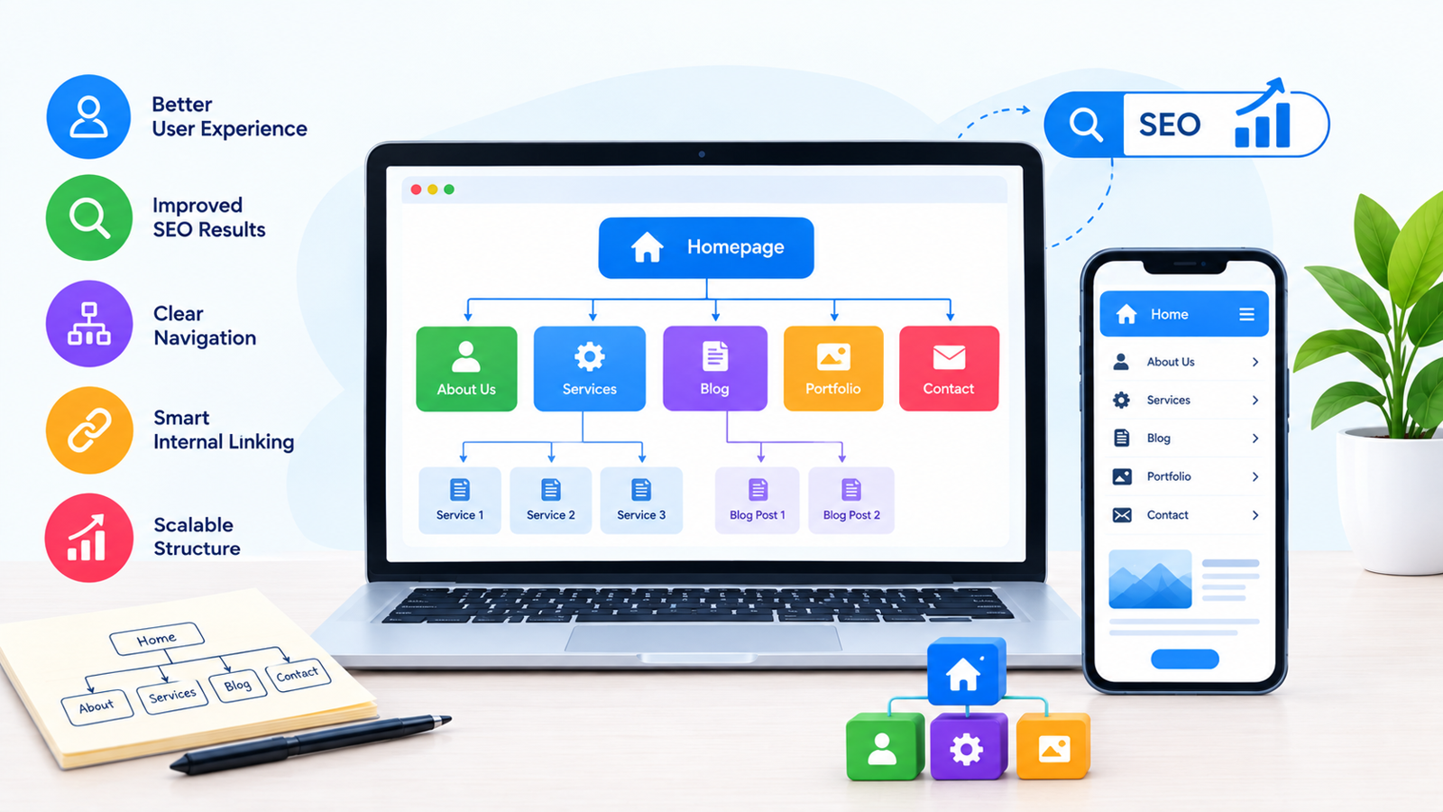
Mobile users have limited screen space, so complicated navigation can quickly become frustrating. A business website should have a clear navigation structure that allows visitors to find important pages without unnecessary steps.
Essential pages such as Home, About, Services, Products, Contact, and other important sections should be easy to access. A well-designed mobile menu can keep the interface clean while still providing access to the complete website.
The goal is to help visitors reach the information they need with as little confusion as possible.
3. Make Text Easy to Read
Small text can make a mobile website difficult to use. Visitors should not need to constantly zoom in to read headings, paragraphs, service descriptions, or other important information.
Use readable font sizes, sufficient line spacing, and clear visual hierarchy. Headings should stand out from body content, while paragraphs should be divided into manageable sections.
Readable content improves usability and allows visitors to understand your business information more comfortably on smaller screens.
4. Optimize Images for Mobile Devices
Large and unoptimized images can significantly increase page loading time, particularly for visitors using mobile networks.
Business websites should use appropriately sized images and modern image optimization techniques. Compressing images while maintaining acceptable visual quality can reduce unnecessary page weight.
Images should also be responsive so they fit within the available screen width without creating horizontal scrolling.
5. Improve Mobile Page Speed
Website speed is an important part of the mobile experience. Visitors may leave a page if they have to wait too long for content to appear.
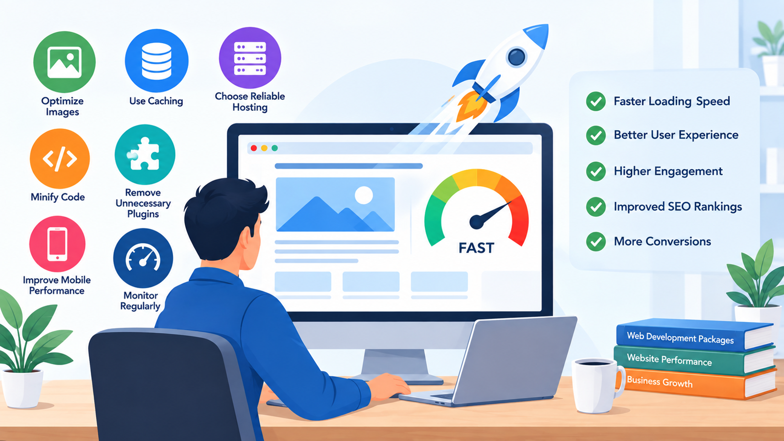
Businesses can improve mobile performance by optimizing images, reducing unnecessary scripts, using browser caching, minimizing excessive plugins, optimizing code, and selecting suitable hosting infrastructure.
Performance should be considered during website development rather than treated as something to fix only after the website is launched.
6. Make Buttons Easy to Tap
Buttons and interactive elements should be large enough and spaced appropriately for touch interaction.
For example, buttons such as “Contact Us,” “Request a Quote,” “Buy Now,” or “Get Started” should be easy to identify and tap without accidentally selecting another element.
A mobile-friendly website should consider how people actually interact with a touchscreen rather than simply shrinking desktop elements.
7. Optimize Contact Forms for Mobile
Contact forms are often important for business websites because they can generate inquiries and leads. However, a complicated form can discourage mobile visitors from completing it.
Keep forms as simple as possible and only request information that is genuinely necessary. Input fields should be easy to select, and the form should work properly with mobile keyboards.
Businesses should also test forms on different smartphones to ensure that users can complete and submit them without technical problems.
8. Avoid Horizontal Scrolling
Visitors should generally be able to navigate a business website by scrolling vertically. If users have to move the page from left to right to view content, the website may not be properly optimized for smaller screens.
Tables, images, embedded content, and other page elements should be designed carefully so they do not exceed the available screen width.
Responsive layouts help prevent these issues by adapting content to the device's dimensions.
9. Make Important Information Easy to Find
Mobile visitors may not spend a lot of time searching for basic business information. Important details should therefore be easy to locate.
Depending on the business, this could include contact information, services, pricing information, business location, operating hours, product details, or inquiry options.
Clear content organization allows visitors to quickly understand what the business offers and what action they can take next.
10. Use Mobile-Friendly Calls to Action
Calls to action should be visible and easy to interact with on mobile screens. A visitor should understand what action is available without having to search through a long page.
For example, service websites may use actions such as contacting the company, requesting a quotation, scheduling a consultation, or submitting an inquiry.
CTA placement should feel natural rather than overwhelming the visitor with too many competing buttons.
11. Test the Website on Different Devices
A website that works properly on one smartphone may still have problems on another device or screen size. Testing is therefore an important part of mobile-friendly website development.
Businesses should review important pages on different smartphones, tablets, and desktop screen sizes. Navigation menus, forms, images, buttons, content spacing, and page loading should all be checked.
Testing before launch can help identify usability problems before customers encounter them.
12. Keep Mobile Performance in Mind During Future Updates
Making a website mobile-friendly is not a one-time task. New pages, plugins, images, scripts, forms, and integrations can affect mobile performance over time.
Whenever new content or functionality is added, businesses should check whether it works properly on smaller screens.
Regular website maintenance and performance testing can help keep the mobile experience consistent as the website grows.
Why Mobile-Friendly Design Matters for Business Websites
A mobile-friendly website can make it easier for visitors to access business information and interact with important website features. When navigation, content, forms, and calls to action work smoothly, users can move through the website with less friction.
Mobile responsiveness can also contribute to a professional online presence. A website that works poorly on smartphones may create a less positive impression, while a well-structured mobile experience can make the business website easier to use.
For businesses investing in website development, mobile responsiveness should therefore be considered a core requirement rather than an optional feature.
Mobile-Friendly Website Checklist
Before launching a business website, check whether:
The website layout adapts to different screen sizes.
Text is readable without zooming.
Navigation works properly on mobile.
Images fit within the screen.
Pages load efficiently.
Buttons are easy to tap.
Contact forms work correctly.
There is no unnecessary horizontal scrolling.
Important business information is easy to find.
Calls to action are clearly visible.
The website has been tested on multiple devices.
New updates are checked for mobile compatibility.
How Web Development Packages Can Support Mobile-Friendly Websites
When comparing Web Development Packages, businesses should look beyond the number of pages or design features included in the package. It is also important to understand whether responsive design, mobile optimization, testing, performance optimization, and technical support are part of the development process.
A suitable website development package should match the business's actual requirements. A simple company website may need a different development approach from an ecommerce website with product filters, checkout functionality, customer accounts, and multiple integrations.
Discussing mobile requirements before development can help ensure that the final website is designed for the devices your customers are likely to use.
Common Mobile-Friendly Website Mistakes
Some common mistakes include using very small text, placing buttons too close together, uploading oversized images, creating complicated menus, using intrusive pop-ups, ignoring mobile page speed, and failing to test contact forms.
Another common problem is designing the website for desktop first and simply shrinking the layout for mobile. Mobile users interact with websites differently, so the mobile experience should be considered throughout the development process.
Conclusion
A mobile-friendly website is an important part of modern business website development. Responsive design, readable content, optimized images, fast loading, simple navigation, touch-friendly buttons, and properly tested forms can make a website easier to use across different devices.
Businesses planning a new website should discuss mobile responsiveness from the beginning of the development project. If you are choosing between different Web Development Packages, compare not only design and pricing but also responsive development, performance, testing, and future support.
If you are planning a professional mobile-friendly business website, Get in Touch to discuss your website development requirements.
For businesses looking for professional SEO and digital marketing support, RankON Technologies is an experienced agency offering services such as SEO, Google Ads, social media marketing, website development, and content marketing. You can also explore its TopDevelopers profile to learn more about the company's services and experience.
Frequently Asked Questions
What is a mobile-friendly website?
A mobile-friendly website is designed to work comfortably on smartphones and tablets by adapting its layout, text, images, navigation, and interactive elements to smaller screens.
Why is responsive design important for a business website?
Responsive design allows a website to adjust to different screen sizes, helping visitors use the website comfortably across smartphones, tablets, laptops, and desktops.
How can I make my existing website mobile-friendly?
You can improve an existing website by implementing responsive design, optimizing images, improving page speed, simplifying navigation, adjusting typography, improving forms, and testing the website across different devices.
Does a mobile-friendly website improve user experience?
Yes. A mobile-friendly design can make content easier to read, navigation easier to use, and important actions such as contacting a business or submitting a form more convenient.
Should mobile responsiveness be included in Web Development Packages?
Businesses should check whether responsive design and mobile testing are included when comparing Web Development Packages. These features are important for creating a website that works across different devices.








Write a comment ...